


There are artists on Newgrounds who draw with a kind of old anime atmosphere, and I've long admired them, but didn't know their methods. Recently, however, I finally learned a technique to create similar illustrations by combining two effects: "Chromatic Aberration" and "Saturation and Brightness Adjustment". This method was shared on these two sites:
[Japanese] Creating an Atmospheric Screen Using Chromatic Aberration
https://www.clipstudio.net/oekaki/archives/148819
[Japanese] Cel Animation Style Illustration Processing
https://www.pixiv.net/artworks/59794801
I am so happy to have learned this technique, and I would like to share it with you in this article.
STEP 1: Adding Chromatic Aberration
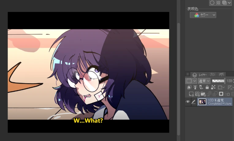
First, prepare a completed illustration.
Next, open the image in a photo editor (Photoshop, CLIP STUDIO PAINT, SAI). In my case, I used CLIP STUDIO PAINT,
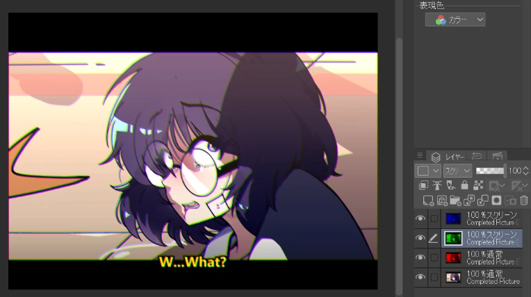
and duplicate the layer four times. Only the top three layers will be used in STEP 1, with the bottom layer kept as a backup.

Prepare each of the top three layers and set them to "multiply layer." Then fill each layer with pure Red, Green, and Blue colors, respectively. 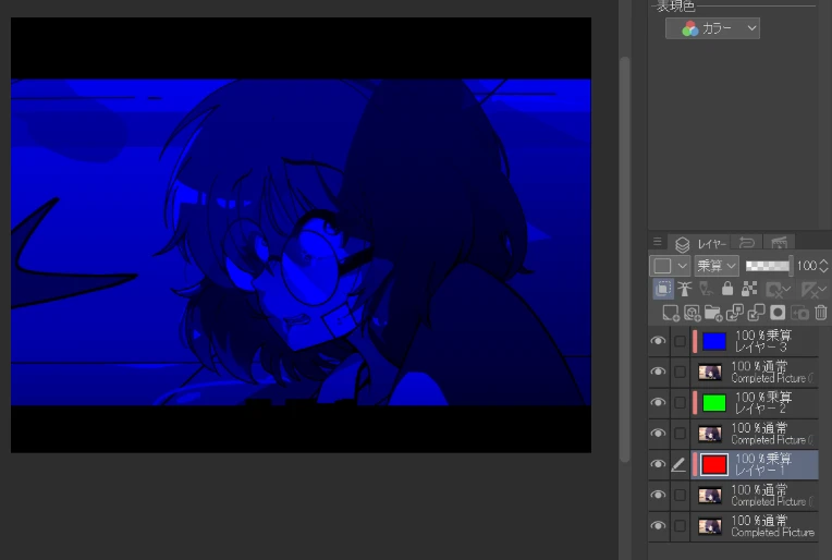
Merge each of the RGB layers with their respective layers.
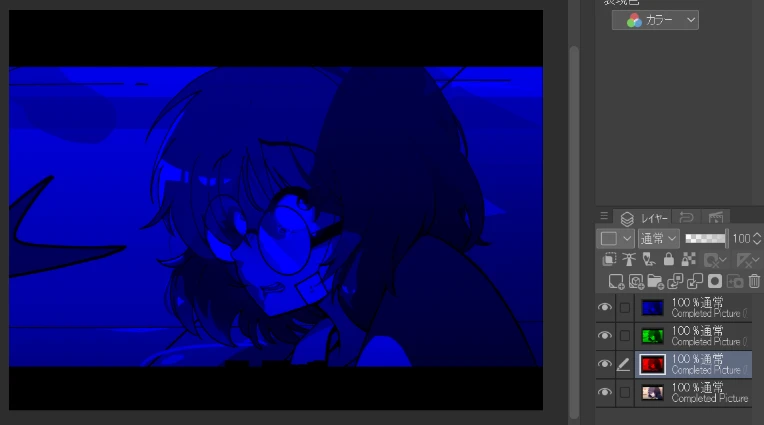
Change the layer mode of the top two merged layers to "screen."
When you move each of the top two layers, the chromatic aberration effect will be applied. This completes the first step.
STEP 2: Creating an Old Anime Style
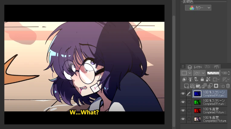
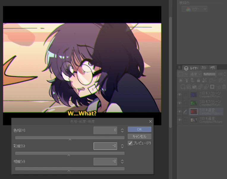
To make it look like old anime, reduce the brightness and saturation of each of the three RGB layers. Lowering the brightness and saturation of each layer will make the screen duller (and darker), giving it an aged look. How much to lower them depends on your taste, but I chose random numbers around -4 to make it look more decayed.
Set the transparency of the top three RGB layers to about 90%. Adjusting this number will change the blend ratio between the old anime-style layers and the original layer.
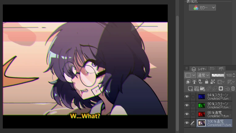
Once you have completed the above steps, your illustration will change to an old anime style compared to the original. Additionally, to create an old anime feel, you need to choose appropriate colors and use dark shadows, but these steps are omitted in this explanation. If you find any other necessary steps, please let me know!